Soundtrack to the End of the World
In order to communicate numerical research, one must effectively and memorably convey dataset trends. Every statistic that makes it into a research paper or marketing campaign is there because the entity communicating the data believes that it represents an important finding. Usually, this is done through charts, graphs, and tables.
Sonification is the communication of data through sound. Different algorithms can be used to map numbers onto sounds, typically with higher numbers corresponding to a higher pitch. Altering the tonality of the sound, the number of notes included in the algorithm, and the frequency with which the data is sampled changes the sonic experience of the listener.
The techniques used to sonify a dataset are slightly more obvious versions of the scaling, denoising, and visual design going into any data communication. In the same way that a good chart can lead to broader comprehension, some sonic compositions can be more memorable to listeners, having a greater impact on their future actions. In the context of climate change, the stakes are high, and memorable scientific communications are at a premium.
It is important to note also that we live in an age of disinformation. Many memorable statistics are simply successful conveyances of a study’s result; some are faulty. A better understanding of data communication techniques can help in disentangling a persuasive communication of numbers from a communication that fabricates persuasive numbers.
This project, completed as my senior thesis at Princeton University, compares sonifications of minor and major tonality, sonifications mapped over one versus six octaves, and sonifications of monthly versus yearly data points. This allows an exploration of the ways in which numerical communications can differ without the numbers themselves being altered.
In this case, the numbers at hand are climate model temperature predictions. These models are built by geologists, hydrologists, and chemists to imitate the Earth’s atmospheric and oceanic cycles with higher carbon dioxide concentrations. These models have limitations, but when compared against one another, offer valuable insight for policymaking and planning. The models used are the 4.5 and 8.5 Representative Construction Pathways (RCPs) from The International Panel on Climate Change’s Fifth Assessment Report (IPCC5) [6] for New York City, NY, downscaled by the Community Climate System Model (CCSM) [7]. RCP 4.5 is a model that assumes sizable but realistic emissions reductions. RCP 8.5 is built with business-as-usual carbon dioxide increases.
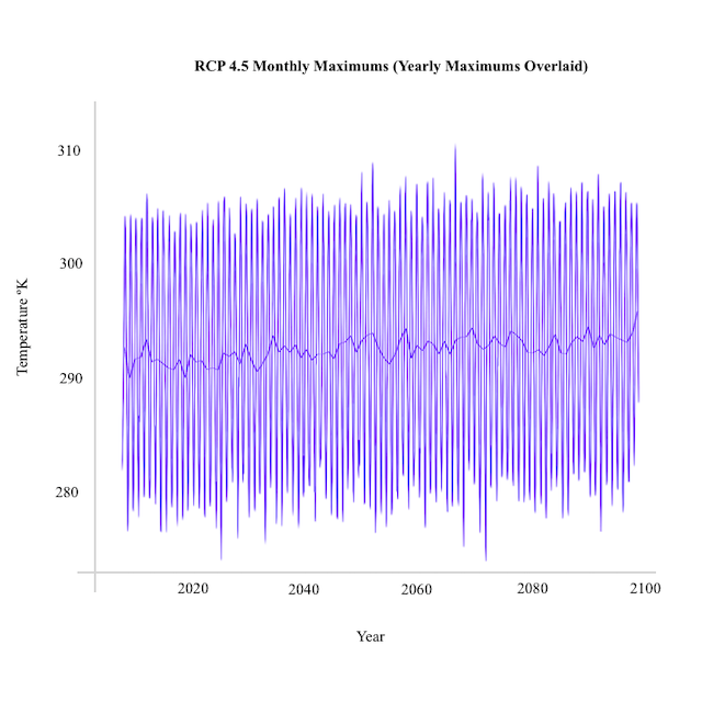
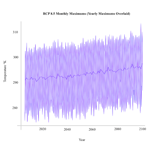
The final sonifications for the project compare the two datasets. They consist of a backtrack of each RCP’s monthly temperature data sonified over one octave. The yearly data for each RCP sonified over six octaves is then overlaid as a sort of melody. These pieces are below, along with their graphical equivalents.


It is difficult to compare climate models because changes in the atmosphere’s temperature are much more minute than the effects they induce. The maximum temperature for RCP 8.5 is only 4º higher than that of RCP 4.5. This is one of the reasons people have trouble internalizing the effect that we are having on the natural world.
Comparing two sonifications created with the same algorithm hopefully sparks a deeper understanding of the differences between the two datasets, and the much more drastic rise of the latter. The knowledge that these differences correspond to possible futures is powerful.
Combining monthly with yearly data allows a listener to better internalize the complexity of the story the model is telling; a backtrack of the seasonal variation behind the gradual rise in temperature.
The visual media included in the background of these compositions consists of my personal photography and artwork, revolving around themes of urban landscapes, climate change, and futurism.
Explore the text and videos below for more information!
To Sonify:
1) Determine the data to be used and its temporality (i.e. monthly vs yearly datapoints).
2) Determine the minimum and maximum of the dataset.
3) Set the key signature.
4) Choose the tonality (minor or major).
5) Choose the lowest and highest note (how many octaves to map over).
6) Set the tempo.
7) Run the code, or match intermediary notes to whichever location between the high and low notes best corresponds to their relative proximity to the minimum and maximum. For example, if data were mapped over an octave, and the first data point was 7/8 of the maximum, it would be mapped to the note coming directly before the top of the octave.
8) Combine the resulting audio file with other sonic and visual material.

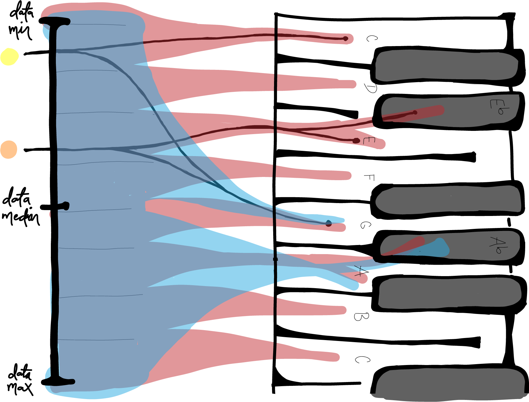
The blue pathway maps the data over two notes, while the red pathway maps over eight. Notice that the yellow point, located at 1/8 of the maximum data value, and the orange point, located at 3/8 of the maximum data value, are mapped to the same note via the blue pathway, but not the red. The alternative pathways between E and Eb and A and Ab are determined by choice of tonality (major or minor tone).

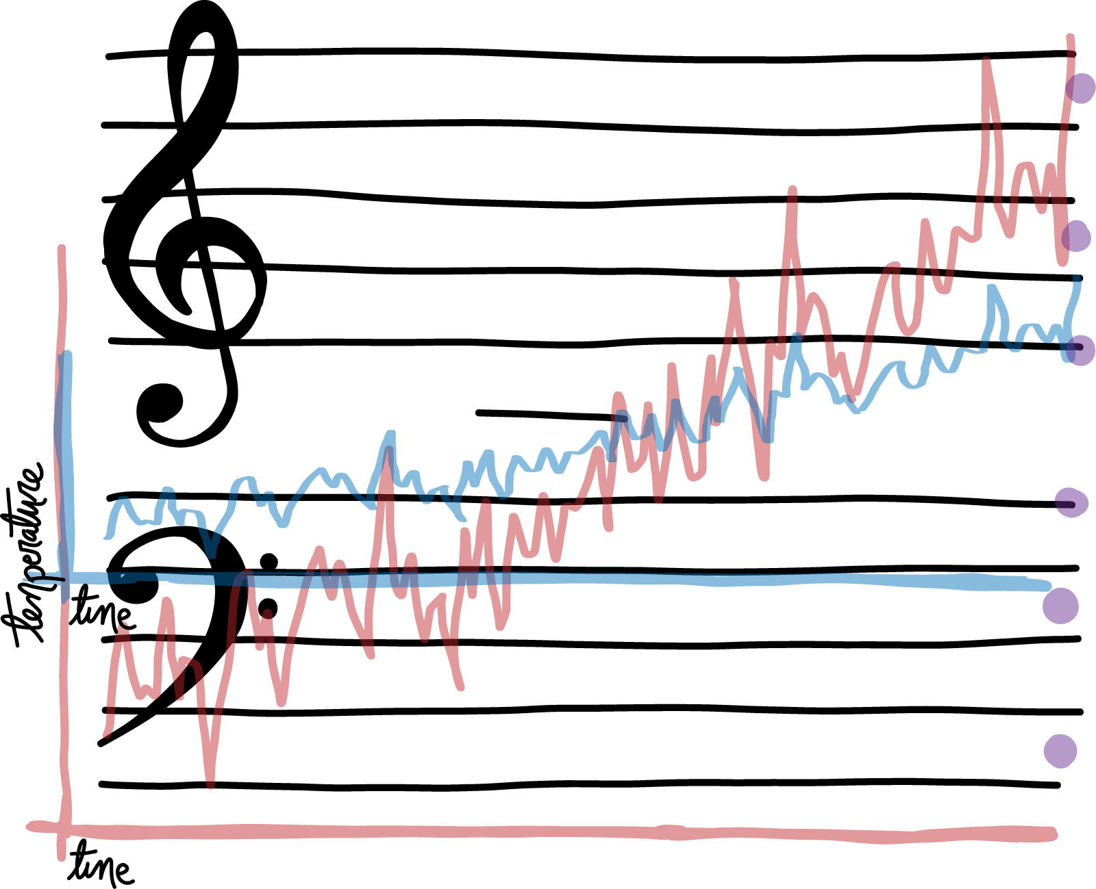
This graphic shows numerical data twice plotted over a musical staff. The blue plot is stretched out over less notes vertically (one octave rather than three), diminishing the sonic variation in the numerical differences. The dots on the right hand side delineate the E and A flats, which would be played instead of the E and A naturals in a minor tonality.
The sonic experience was deconstructed and studied using data from RCP 8.5. Use the tabs below to explore the differences that result from conveying the same data, but in different ways.
Using datapoints at different time intervals causes long-term trends to sound different. In the case of temperature data, monthly data is made up of rapid seasonal fluctuation. For every year that passes, the temperatures have to include winter, as well as summer, values. This often causes the monthly data to sound more confusing than the yearly data, which is composed of the average of every twelve monthly values. Averaging takes away a listener’s ability to fully internalize the annual patterns of the data, but at the same time should make it easier to recognize the general trend of increasing yearly temperature.
These videos illustrate the difference in sound between monthly and yearly datapoints. The yearly piece in this section was sped up to three times its 120 bpm speed to better illustrate this potential increase in trend recognition.
Especially in the Western world, a major tonality signifies comfort and positivity more so than a minor tonality. The minor mapping uses Eb and Ab rather than E and A. Changing those notes by that half step has a noticeable effect on the feel of the sound. Sonifications mapped to minor tonalities, stressing the minor 3rd, have the potential to make an audience feel more uncomfortable than sonifications using the more “beautiful” major 3rd. This is because more discordant intervals are being used as the building blocks of the sonification, creating a more agitating sound.
These videos illustrate this phenomenon. The pieces in this section were sped up to three times their 120 bpm speed.
A wider range between the lowest and highest notes in an algorithm allows for more nuance in a sonification (less “rounding” up or down to surrounding notes). For example, mapping to a range of eight notes means that the highest 1/8 of the dataset is mapped to the highest note. Since the temperature is rising, the highest note is played more and more frequently as the sonification goes on. In contrast, when this data is mapped over six octaves, or 43 notes, only the top 1/43rd of the data is mapped to the highest note, and the highest note is only played once or twice. With the set mapped over more octaves, there are more notes at play. This allows for a greater level of detail to be communicated through sound, but also is sometimes overwhelming to a listener.
These videos show the difference between one- versus six-octave mapping.
“The saddest aspect of life right now is that science gathers knowledge much faster than society gathers wisdom.”
Isaac Asimov
Numbers, equations, regressions. To measure the world. To understand it. To build things upon it. The measurements work quite well. The understanding, however, depends on much more than the measurements, and is often flawed. This results in externalized costs and flawed power structures, which end up reinforcing themselves as we build ever more complex measurement systems.
The world of climate data is uniquely complex. Exponential improvements in technology over the past decades have meant that measurements of the Earth’s climate systems are now constant, monitoring the atmosphere’s every move. The goal of much of this data collection is to then forecast the implications that the climate’s current warming trends have on future warming trends and to predict the likelihood of future extreme weather events. Ultimately, this data collection strives to understand the various possible futures we have ahead of us. This is done through climate modeling systems.
"Watch out for intellect, because it knows so much it knows nothing and leaves you hanging upside down, mouthing knowledge as your heart falls out your mouth.”
Anne Sexton
The problem is that there are many different climate modeling systems, and each of these systems produce astronomical amounts of data that stretch across time and space. Experts, let alone the general public, are not able to personally examine every scrap of this information. That task is given to computers. But computers aren’t the ones who interpret data in order to make informed policy decisions or individual behavioral choices. Computers aren’t the ones who have to internalize the fact that actual lives are at stake here: lives of people today and lives of people generations down the line. Computers aren’t the ones who have to prioritize climate in their day-to-day lives. In order for data to be useful to society, it must be communicated by scientists to the general public. Because there is so much of it, picking out the notable trends becomes a necessity.
Science is incredibly important. But as a collective, humans do not understand, internalize, or respond to science. We respond to stories. When we do end up responding to science, it is almost always because the story behind the data was told in a convincing way.
This isn’t to say that any of this data should be fabricated or twisted. The numbers themselves should be verified and peer-reviewed to the upmost extent. But creating a care for numbers amongst the broader population has always been a challenge. In any scenario involving the communication of numbers to the broader public, there have been decisions made about which data to present and how to present it. If these decisions change the reality of the data, they are fraudulent. But in almost every case, there are several ways to accurately portray the same data, with vastly different takeaways for the audience in terms of comprehension, relevance, and urgency.
The process of making decisions revolving around data communications is referred to as framing. Framing allows a scientist to pick out and highlight the most important trends in a dataset in order to aid broader comprehension. This is usually done visually, through graphs. Laying out specifically chosen numbers over space allows people to communicate important changes and trends in these numbers over time.
This thesis focuses on a type of dataset framing called sonification. Sonification is the conceptualization of data through sound. There are many different algorithms that can be used to sonify, each a different way of mapping notes into sound, typically with higher numbers corresponding to a higher pitch. Sonification first gained traction when entities such as NASA [1] began using it to help people understand the layout of galaxies. People have since used the technique to make better sense of income inequality on New York City subway lines [2] and to convey spatial data to people who are visually impaired [3] or less scientifically literate [4]. Various projects have also worked on sonifying climate data in particular, showing increasing temperatures and carbon dioxide levels over time through a potentially more impactful medium.
“Music is psychology. And if the music does not penetrate the heart, the soul, the mind and the body, then you ain’t gonna feel it . . . And if you don’t feel it, you can’t know it.”
Peter Tosh
Music has always been an attempt to aggregate historical data, stories from the past, and transform it into a narrative to be interpreted by others. Classical composers drew inspiration from their predecessors, blues and jazz artists draw from the cultural strife and lost identity that is indicative of so much of Black history, a teen band tries to convey the complexities of bygone love. When these narratives hit just right, they become a cultural moment, a shifting of tectonic plates. They inspire listeners because of the personal connections drawn from the works. Because the music’s interpretation of the past resonated with listeners' own pasts, as well.
As numerical data becomes increasingly prevalent in society, we face the task of interpreting it, too. To help us make sense of the world. To help us make sense of ourselves. To help us make sense of potential pathways into the future.
“Art never stopped a war and never got anybody a job. That was never its function. Art cannot change events. But it can change people. It can affect people so they are changed. . . because people are enriched, ennobled, encouraged, then they can act in a way that may affect the course of events. . . by the way they vote, by the way they behave, by the way they think.”
Leonard Bernstein
Climate change necessitates radical changes in individual actions, psyches, and consumption habits. Vast infrastructural changes, such as transitioning the energy grid and establishing a more circular economy, are necessary in order to preserve the delicate balance of humanity and society with the natural world, as well as to prevent the increases in warming and catastrophe that climate models predict. Most of this must be orchestrated by political entities, who hold the power to alter societal structures. Political changes depend on popular support, which depends on the population truly understanding what is at stake. Thus, decarbonization efforts rely upon compelling data communications.
Today’s world does not default to sustainability. In order to normalize low-carbon lifestyles and incentivize low-carbon innovations, a critical mass of the population must actively care about pressuring a change in default. This requires prioritizing sustainability over other things, such as convenience. If somebody has seen climate data trends framed and conveyed more impactfully, they could be more likely to bring this data and its implications to mind when voting and making everyday decisions.
This thesis hopes to speak for the importance of considering feeling when talking about numbers and to help in laying a foundation and framework for climate model sonification. Because of its inherently artistic and emotionally-triggering properties, sonification has the potential to nudge people towards less carbon-intensive actions and policy choices on an individual level by making them step back and internalize data in a different way. This is especially powerful when that data deals with the future. Internalizing the numerical descriptions of our potential futures could help us gain agency over which one is realized. And in the case that we don’t actually have any agency, it could help offer solace by providing a lens into the gravity of the unknown.
“We are responsible for the world in which we find ourselves, if only because we are the only sentient force that can change it.”
James Baldwin
Humans are crazy wacky wild. Society is a beautiful glitch of consciousness and progression of collective understanding. It is in our best interest to maximize the exquisite and powerful interactions within humanity and between humanity and the natural world, if only for the purpose of self-preservation.
As far as climate goes, this is all a game of a few degrees. Four degrees is the difference between the maximum temperatures of RCP 4.5 and RCP 8.5. As individuals, we do not perceive four degrees’ difference as we step outside. But four degrees, compounded into atmospheric feedback loops over many years, results in a drastically different set of ecosystems and level of livability for the future world.
We do have some control over how many of these degrees of warming actually come to fruition. It is our action, after all, that is causing the warming in the first place. But decreasing emissions to the necessary level is a matter of collective action. One person’s choices only matter when compounded across the population. The easiest way to compound these choices is by changing the choice architecture presented to this population. But in order to change the choice architecture, that very population has to want to change it. The American economy and consumption habits are a direct reflection of what the people truly care about. Not what they portend to care about, in abstract, but what they actually prioritize when going about daily life.
“Art is not a pleasure, a solace, or an amusement. Art is a great matter. Art is an organ of human life, transmitting man’s reasonable perception into feeling.”
Leo Tolstoy
A person’s priorities only change when they fully realize a new piece of information. Collection of information requires absurd amounts of coordination. Science does this quite well. However, effective dissemination of information, getting people to realize it, requires something more subtle. It requires one to effectively wield the tools of communication and perfect the art of the minutia. If it was just about getting people to look at data, globalized communications would’ve solved all of our problems. We would live in a utopia. But it’s about more than that.
People oscillate on a spectrum between rationality and feeling. Our decisions reflect the information and subtext that we’ve internalized as of the moment that decision was made. This means that we don’t push back against the status quo because we’ve merely seen the numbers. We push back when we care. When a story strikes the right chord of perception. When something becomes personal enough to go against the grain.
And art is a tool of personalization. Art allows us to remind each other that there are other eyes viewing, brains thinking, hearts beating, and that these eyes and brains and hearts might have a different perspective than our own. Simultaneously, art works against desensitization. Shoving painful concepts in faces numbs viewers. Art, however, takes a circuitous route that encourages the internalization of these concepts. People, then, hopefully look more closely at the world and its problems and have a greater motivation to find and move towards solutions.
I’m not one to say whether art can actually motivate the shift in collective mindset that is required to create a truly sustainable society. But I will say that I believe to my core that if there were such a thing that could do so, art would be it.
Music serves the purpose of storytelling. Of taking scraps of our individual and collective pasts and weaving them into a narrative. Of making sense of multitudes of moments by leveraging the minutia of the sonic experience. Society is becoming increasingly dependent on and saturated by technology, numbers, and vast amounts of data. These things seem daunting in the same way that cultural histories and personal experiences always have. And music can make sense of them, too.
This project draws from the Multivariate Adaptive Constructed Analogs (MACA) dataset [34], which uses CMIP5 RCPs 4.5 and 8.5 [8] to produce CSV files of historical and future temperature values for specific latitude and longitudes, downscaled by various global models. The data used for this project was downscaled by the CCSM4 [7] and consists of maximum monthly temperatures for the NYC region.
Code for this project was created drawing from the MidiTime sonification API [35] created by Michael Corey. MidiTime’s commands convert time-series data into pitch, velocity, and duration values. The commands can be combined in different ways to specify how the code should come to these values.
Many thanks to Professor Catherine Peters, the main advisor for this project. Insights from research work with the Princeton Behavioral Science for Policy Lab also played a huge role.
A full list of references can be found here.